Redesigning KLP’s Reports
When my old nemesis, Gautam John asked me to help out and make the school assessment reports that the Karnataka Learning Partnership generates a little bit more attractive, I jumped at the chance to volunteer some time and do some information design.
A bit about the Karnataka Learning Partnership, where all of this number crunching and report-making happens:
The Karnataka Learning Partnership is a is a public platform where all the stakeholders involved in primary education can participate and contribute to the cause of ensuring better schools and education for all children in Karnataka. This effort envisages a system where a network of non-profits working across multiple verticals – education, health, nutrition etc., will bring their data together to present a factual assessment and this will be used to galvanize community led ownership of the public schooling system to drive change.
A screenshot of the current reports, generated by KLP (click to see larger):

Some of the complications of this redesign were that while the reports were being generated into HTML/CSS and Google Charts making the fancy graphs and pie-charts, the primary goal with the reports was to bring out printed copies to distribute to the various stakeholders on the ground, including (I assume), elected representatives, school authorities, teachers, parents and students.
However, translating an HTML/CSS layout into a print layout is an exercise which is at best filled with frustration for all parties involved and at worst can lead to data simply not being visible. Background images, some types of generated content and critical layout elements (such as floats) are simply omitted; page breaks are difficult to control and can lead to situations where the division of information makes understanding what’s going on very difficult.
Having said that, this is what I came up with (as before, click to see larger):

Design Notes
I find that the 960 grid system a very useful aid to rapidly add order to chaos; it is especially suited for web applications or information design as it allows one to divide your page conveniently into groups of 12/16 columns (and therefore, 2, 3 and 4-column layouts) are natural outcomes. Cameron Moll was the first person (that I remember) advocating a 960 grid system, and the wonderfully named 960.gs has a whole horde of resources for you to use.
Colour
Since this report was primarily intended for print, I looked at using a very restrained colour palette — given that it will often be photocopied/printed out in black and white, it doesn’t make sense to use colour as the primary way to convey information. This is a core principle of online accessibility guidelines as well (see WCAG 2.0 1.4.8, Visual Presentation for more information).
Information Design
I have drawn on work that Dave McCandless (of Information is Beautiful fame) did for KLP, to represent student demographics. I’ve used icons from the lovely Noun Project (which I keep going back to); my only complaint is that they don’t have enough. I wasn’t able to find one for “School” or “Mother”. I have blatantly reused information design for comparing progress between two different districts (or with a larger super-group, in this case, the city of Bangalore) from the exquisite, Ben Fry-designed NBC Education Network Scorecard website.
Implementation Tips
There are only two parts of this redesign which might prove slightly complex to implement. The first is depicting the number of students using icons (I apologise for the hackneyed use of pink and blue for girls and boys).
Depicting Demographics
For each gender, create an empty <div> with a height equal to the icon’s height (in this case, 50px), and a width equal to the ratio of boys/girls. I have taken to depicting 10% of the population with one “person” icon (23px wide), with some padding after (12px) to ensure even spacing, for a total width of 35px for 10% of each demographic respectively. Adding this width into your HTML from the KLP CMS/database should be fairly simple — it might look something like this:
<div id="demographics">
<h2>Student Demographics</h2>
<span id="female" width="($FemalePercentage*3.5)px"></span>
<h3>$FemaleCount</h3>
<span id="male" width="($MalePercentage*3.5)px"></span>
<h3>$MaleCount</h3>
<h3>$MaleCount+$FemaleCount students</h3>
</div><!-- #demographics -->
In your CSS, you merely specify the icon to be a repeating background image and it should fill up the appropriate amount of space.span#female {background: url('images/Icon-Female.png') repeat-x 0 0;}
Assessing Assessment
The next section is equally simple, though it might be done more easily with the <canvas> element. I haven’t used <canvas> much, so will leave that for someone better versed with the tech.
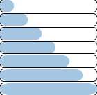
Pulling in the percentage data from your database, merely change the image name that you call. Have a bank of 100 images with variable amounts of fill, as shown below:

That’s it for now. I look forward to your feedback and to building on this.
Rahul Gonsalves Newsletter
Join the newsletter to receive the latest updates in your inbox.